Climate Change

In the past week, I’ve been to some excellent talks. The first was on Biomarkers at the Manchester Literary and Philosophical Society, and the second was Misinformation in Climate Change at Manchester Statistical Society. And both of these followed the IMA’s Early Career Mathematicians conference at Warwick, which had some excellent chat and food for thought around Big Data and effective teaching in particular.

Whilst I could share my learnings about biomarkers for personalised medicine, which makes a lot of sense and I do believe it will help the world, instead I will focus on climate change. It was aimed at a more advanced audience and had some excellent content, thanks Stephan Lewandowski!

There are a few key messages I’d like to share.

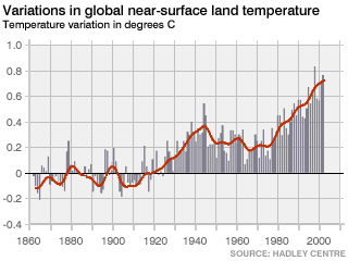
Climate is different to weather

This is worth being clear on: climate is weather over a relatively long period of time. Weather stations very near to one another can have very different (temperature) readings over time. Rather than looking at the absolute value, if you instead look at the changes in temperature you will be able to find correlations. It is these that give us graphs such as:

climate1
Note it is variation rather than absolute

Misinformation

Given any time series of climate, it is possible to find local places where the absolute temperate trend goes down, particularly if you can pick the time window.

Interestingly, Stephan’s research has showed that belief in other conspiracy theories, such as that the FBI was responsible for the assassination of Martin Luther King, Jr., was associated with being more likely to endorse climate change denial. Presumably(?) this effect is related to Confirmation Bias. If you’re interested in learning more, take a look at the Debunking Handbook.

Prediction is different to projection

According to Stephan, most climate change models are projections. That is, they use the historical data to project forward what is likely to happen. There are also some climate change models which are predictions, in that they are physics models which take the latest physical inputs and use them to predict future climate. These are often much more complex…

Climate change is hard to forecast

I hadn’t appreciated also how difficult to forecast El Niño is. El Niño is warming of the eastern tropical Pacific Ocean, the opposite (cooling) effect being called La Niña. Reliable estimates for El Nino are available around 6 months away, which given the huge changes that happen as a result I find astonishing. The immediate consequences are pretty severe:

El-Nino.jpg
Source: welt hunger hilfe

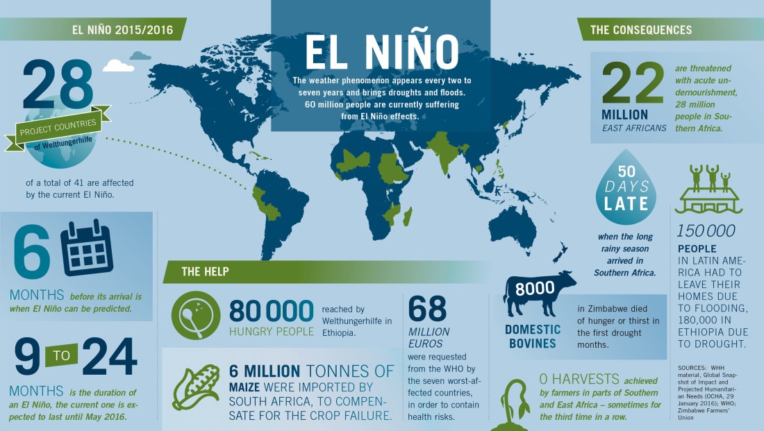
As you can see from the above infographic, it turns out that El Niño massively influences global temperatures. Scientists are trying to work out if there is a link between this and climate change (eg in Nature). Given how challenging this one section of global climate is, it is no wonder that global climate change is extremely difficult to forecast. Understanding this seems key to understanding how the climate is changing.

The future

In any case, our climate matters. In as little as 30 years (2047), we could be experiencing climatically extreme weather. Unfortunately since CO2 takes a relatively long time to be removed from the atmosphere, even if we stopping emitting CO2 today we would still have these extreme events by 2069. Basically, I think we need new tech.


Open Data

In a previous post, several months ago, we talked about Chaos and the Mandelbrot Set: an innovation brought about by the advent of computers.

In this post, we’ll talk about a present-day innovation that is promising similar levels of disruption: Open Data.

Open Data is data that is, well, open, in the sense that it is accessible and usable by anyone. More precisely, the Open Definition states:

A piece of data is open if anyone is free to use, reuse, and redistribute it – subject only, at most, to the requirement to attribute and/or share-alike

The point of this post is to share some of the cool resources I’ve found, so the reader can take a look for themselves. In a subsequent post, I’ll be sharing some of the insights I’ve found by looking at a small portion of this data. Others are doing lots of cool things too, especially visualisations such as those found on http://www.informationisbeautiful.net/ and https://www.reddit.com/r/dataisbeautiful/.

Sources

One of my go-to’s is data.gov.uk. This includes lots of government-level data, of varying quality. By quality, I mean usability and usefulness. For example, a lat-long might be useful for some things, a postcode or address for other things, or an administrative boundary for yet others. This means it can be very hard to “join” the data together, as the way they store something like “location” is many different ways. I often find myself using intermediate tables that map lat-long into postcodes etc., which takes time and effort (and lines of code).

Another nice meta-source of datasets is Reddit, especially the datasets subreddit. There is a huge variety of data there, and people happy to chat about it.

For sample datasets, I use the ones that come with R, listed here. The big advantage with these is they are neat and tidy, so they don’t have missing values etc and are nicely formatted. This makes them very easy to work with. These are ideal for trying out new techniques, and are often used in worked examples of methods which can be found online.

Similarly useful are the kaggle datasets, which cover loads of things from US election polls to video games sales. If you are inclined they have competitions which can help structure your exploration.

A particularly awesome thing if you’re into social data is the European Social Survey. This dataset is collected through a sampled survey across Europe, and is well established. It is conducted every 2 years, since 2002, and contains loads of cool stuff from TV watching habits to whether people voted. It is very wide (ie lots of different things) and reasonably long (around 170,000 respondents), so great fun to play with. They also have a quick analysis tool online so you can do some quick playing without downloading the dataset (it does require signing up by email for a free login).

Why is Open Data disruptive?

Thinking back to the start of the “information age”, the bottleneck was processing. Those with fast computers had the ability to do stuff noone else could do. Technology has made it possible for many people to get access to substantial processing power for very cheap.

Today the bottleneck is access to data. Google is making their business around mastering the world’s data. Facebook and twitter are able to exist precisely because they (in some sense) own data. By making data open, we start to be able to do really cool stuff, joining together seemingly different things and empowering anyone interested. Not only this, but in the public sector, open data means citizens can better hold government officials to account: no bad thing. There is a more polished sales pitch on why open data matters at the Open Data Institute (and they also do some cool stuff supporting Open Data businesses).

Some dodgy stuff

There are obviously concerns around sharing personal data. Deepmind, essentially a branch of Google at this point, has very suspect access to unanonymised patient data. Google also recently changed the rules, making internet browsing personally identifiable:

We may combine personal information from one service with information, including personal information, from other Google services – for example to make it easier to share things with people you know. Depending on your account settings, your activity on other sites and apps may be associated with your personal information in order to improve Google’s services and the ads delivered by Google.

Source: https://www.google.com/policies/privacy/

We’ve got to watch out, and as ever be mindful about who and what we allow our data to be shared with. Sure, this usage of data makes life easier… but at what privacy cost.

allyourdataarebelongtous
PRISM

DNA sequencing: Creating personal stories

Data matters. A great example of a smart use of data is genetic sequencing. This involves 3 billion base pairs, although scientists only know what around 1% of these do. The arguably most important ones are to do with creating proteins. By looking at people with traits, diseases or ancestry, scientists have been able to pick out those sets of genes which seem to match with those attributes. For example, breast cancer risk is 5 times higher if you have a mutation in either of the tumour-suppressing BRCA1 and BRCA2 genes.

Due to science, there are now commercial providers of DNA sequencing available, such as 23andme. They market this as a way to discover more about your ancestry and any genetic health traits you might want to watch out for. To try this out, I bought a kit to see how they surfaced the data in an understandable way. The process itself is really easy, you just give them money and post a tube of your spit to them.

23andme.jpg
nice…

After a few weeks wait for them to process it, you can look at your results. Firstly, you have your actual genetic sequencing. This is perhaps really only of interest (or any use) to geneticists. As part of their service, 23andme pull out the “interesting” parts of the DNA which have been shown (through maths/biology) to correspond to particular traits or ancestry.

They separate this out into:

  • Health:
    • Genetic risks
    • Inherited conditions
    • Drug response
    • Traits (eg hair colour or lactose tolerance)
  • Ancestry:
    • Neanderthal composition
    • Global ancestry (together with a configurable level of “speculativeness”)
    • Family tree (to find relatives who have used the service too)

Part of what is smart about this service is that while it uses DNA as underlying data, it almost entirely hides this from the end user. Instead, they see the outcome for them. They have realised that people don’t care about a sequence like “agaaggttttagctcacctgacttaccgctggaatcgctgtttgatgacgt” but they do care about whether they have a higher risk of Alzheimer’s. Because some of these things are probabilistic, they also put a 1*-4* scale of “Confidence”: again this is easy to read at a glance. It isn’t very engaging, but it looks something like this:

Screen Shot 2016-09-26 at 16.18.08.png
Examples

Perhaps more visually interesting is the ancestry stuff. Apologies that my ancestry isn’t very exciting:

Screen Shot 2016-09-26 at 16.20.14.png
Ancestry, set to “standard” speculation levels (75% confidence)


I hope this has been interesting. Commercial DNA sequencing is a real success story not just for biochemistry and genetics, but also for the industrialisation of these processes and the mathematics and software that makes it possible. The thing that is especially cool, according to me at least, is the ability to make something as complex as genetics accessible, understandable and useful.

Pretty maths

Bear with this post as it goes through some equations at the beginning, but it is worth it. We’ll be doing some of the calculations to get this picture:

Mandel_zoom_00_mandelbrot_set
The Mandelbrot Set

This is the set of numbers “c” such that {\displaystyle z_{n+1}=z_{n}^{2}+c} is bounded. These z are complex numbers, which we’ll ignore for now. It is much easier to understand if we look at some examples:

Let’s say c = -1.

We start with 

This is repeating, and the numbers are bounded.


Let’s now try c = 0.5.

We start with 

We can see that these numbers are getting bigger and bigger, and it is not bounded.

One more: c=-1.9

It bounces around a lot, never getting very big or very small, so it is bounded. It is kinda fun to sit with a calculator and try this.

Mathematicians call this kind of system “chaos”, as it is very sensitive to the starting conditions. Sometimes this is called the butterfly effect. Note that chaotic is not the same as random: in chaotic systems if you know everything about the initial conditions you know what will happen, whereas in random systems even if you knew everything about the initial conditions you wouldn’t know what was going to happen.

Benoit Mandelbrot was one of the first mathematicians to have access to a computer. Hopefully you can also see now why Benoit Mandelbrot needed a computer to work these out. He repeated this for lots of values of c. The pretty picture we started with is really a plot of the set of c (called the Mandelbrot set), where the colours indicate what happens to the sequence (eg how quickly it converges, if it does).

Mandelbrot Set with Axes


You can zoom into the colourised picture to see how complex this is here. Lots of people (me included) think it is pretty cool. It is really worth taking a look to appreciate the complexity.

Other than being pretty, why does this matter?

Stepping back: This picture is made from the formula {\displaystyle z_{n+1}=z_{n}^{2}+c}. This is so simple, and yet gives rise to infinite complexity. In the words of Jonathan Coulton,

Infinite complexity can be defined by simple rules

Benoit Mandelbrot went on to apply this to the behaviour of economic markets, among other things. Later people have applied this to fluid dynamics (video), medicine, engineering, and many other areas. Apparently there is even a Society for Chaos Theory in Psychology & Life Sciences..!

Further reading

This article is good for more explanation of the maths.

Apologies to any Pure mathematicians for the simplifications in this article.


Should I buy wine?

Orley Ashenfelter, an economist at Princeton, wanted to guess the prices that different vintages of Bordeaux wine would have. This prediction would be most useful at the time of picking, so that investors can buy the young wine and allow it to come of age. In his own words:

The goal in this paper is to study how the price of mature wines may be predicted from data available when the grapes are picked, and then to explore the effect that this has on the initial and final prices of the wines.

For those of you not so au-fait with wine, prices vary a lot. At auction in 1991, a dozen bottles from Lafite vineyard were bought for:

  • $649 for a 1964 vintage
  • $190 for a 1965 vintage
  • $1274 for a 1966 vintage

Wines from the same location can vary by a factor of 10 between different years. Before Ashenfelter’s paper, people predicted wine quality by experts, who tasted the wine and then guessed how good it would be in future. Ashenfelter’s great achievement was to bring some simple science to this otherwise untapped field (no pun intended).

He started by using the things that were “common knowledge”: in particular that weather affects quality and thus selling price. He checked this by looking at the historical data:

In general, high quality vintages for Bordeaux wines correspond to the years in which August and September are dry, the growing season is warm, and the previous winter has been wet.

Ashenfelter showed that 80% of price variation could be down to weather, and the remaining 20% down to age. With the given inputs, the model he built was:

log(Price) = Constant + 0.238 x Age + 0.616 x Average growing season temperature (April-September) -0.00386 x August rainfall + 0.001173 x Prior rainfall (October-March)

As it turned out, this simple model was better at guessing quality than the “wine expert”: a success for science against pure intuition. The smart part of his approach was getting insight in to the things people felt mattered (weather) and checking that wisdom. Here, he showed that yes it is quite appropriate to use weather and age to model wine prices.

Through the age variable, it also gives an average 2-3% annual return on investment [1] (note this is pre-2008 so is unlikely to behave like this today[2]).

Should I buy wine? Quite possibly, as long as I don’t drink it all.


Source: http://www.wine-economics.org/workingpapers/AAWE_WP04.pdf

[1] http://onlinelibrary.wiley.com/doi/10.1111/j.1468-0297.2008.02148.x/abstract

[2] http://www.wineinvestmentfund.com/latest-figures/performance-glance.aspx